
Tuesday, 21 October 2014
Monday, 20 October 2014
Desensitized
I got the idea for my focus this year from reading an interview with Sue Coe.


In it she had a small anecdote of how one night she saw a man in the street screaming that he was blind and couldn't see; she was scared of him and had to talk it over in her head before she went over and helped him.
It made me think how were brought up on a culture of fear, we fear each other. There's no sense of brotherhood among us. This made me think of the ways we separate ourselves; gender, culture, religion, race, opinions, age etc
I think its because with the mass use of the internet we are suddenly connected to everyone. Small fish being dropped into an ocean, so we strive to stand out and be different; we advertise ourselves with social media, letting the world know every thought. This gives everyone a catalogue of information on people they meet and they can decide whether they wish to interact with you based on that information.
With this being the norm, when you meet people out in the open its a worrying experience, we don't know all about them. We've become secure in knowledge and without it we feel vulnerable and uncertain.
With this being the norm, when you meet people out in the open its a worrying experience, we don't know all about them. We've become secure in knowledge and without it we feel vulnerable and uncertain.
For example; Hitch hiking. My parents used to Hitch hike and so did people they know. Now I don't know anyone who has ever hitch hiked somewhere. Now were all too aware that some hitch hikers were murdered at some point and now we fear strangers in case they pose the same threat.
All this made me think of this generations exposure to Technology and how its changed the way we act. In some ways we are a lot more fearful; scared of strangers/what they might do. But in other ways it has desensitised us; we were born into a generation where news is world wide with video footage, we've seen countless examples of natural disasters, freak accidents and others bad decisions. So it doesn't really phase us.
This picture was about the over sharing of opinions and how things are exaggerated over the internet. Like mixing skittle in a bowl with M&Ms and serving them at a party: there was out roar among the internet commenters on how this was Satan's work and the worst thing ever. But the reaction over massive natural disasters is no where near the same.
We've started to care more about things that directly link to ourselves, something we personally understand. We all live in our own bubble; seeing the world through devices. Like people who go to music gigs and watch the entire thing through the video recorder on their phones/devices.
We've started to care more about things that directly link to ourselves, something we personally understand. We all live in our own bubble; seeing the world through devices. Like people who go to music gigs and watch the entire thing through the video recorder on their phones/devices.
Fear of other in everyday life
* Ignoring homeless people asking for money:
* People being loud and hysterical on public transport
* Crossing the road to avoid having to pass people
*Stranger danger is ingrained into children from a young age
* sitting on seats in public, always avoid sitting next to a stranger
Technology is now ingrained in our lives.
Thursday, 8 May 2014
End of Module Evaluation
In this project from the beginning it was clear it would be heavily researched. The essay took lot of reading and sifting through information, I was quite a bit short on the word count but after the interim hand in Richard says I managed to pass it. Once I'd finished I started to work on the visual response. The beginning was great, being told to just fill a sketch pad. I drew a lot the first day and completed multiple pages. But then researching to inform my drawing, I struggled to find relevant academic texts and the wording of the documents were complicated. I had a break in the middle of this project where I was working on other modules and in retrospect I let this one go forgotten for too long. But with lots of planning and thumb nailing I managed to pull it into a summative final piece.
Strengths:
1. From the beginning I knew what I wanted to say in my essay, a conclusion tot he question. My conclusion being that form is a function of children's illustration. I think this helped to keep a constant in my work because I focused on that point and worked everything towards it.
2. The sketchpad worked well, mainly at the beginning when this was a new project and I was really into it.
Weaknesses:
1. I struggled to understand the information that helped inform the essay. I think if I'd invested more time in reading and analysing the information I'd have had an easier time writing it and then in turn working on a visual response.
2. The gap I took in the middle of this project I feel is apparent and obvious; the sketches stop being pages flowing from one to the next developing and suddenly it was uncognitive and the character style changed slightly with no development to get there. The other projects I'd been working on affected the drawing I did for this project. If I'd carried on working on this steadily throughout I think that the final piece would have been more summative of what I'd learnt. At this point I feel that the end was more of just a rush to find a suitable final product.
What I've learnt:
1. Function is important but in children's illustration form seems equally important.
2. Organisation is key. Keeping a steady pace of work load makes it easier to develop ideas and makes your decisions flow from one to the next.
3. Mini evaluations throughout, pick out any factors that need improving and help you to realise when something isn't working.
Visual response cont.
I decided to make a gif. I wanted to play with ways to create movement. It took 19 pages of drawing, the light box was essential in this, it really helped make it flow from one image to the next.


Next I had to start compressing my work into an idea for an outcome. First I listed what I wanted from the to show from the project:
1. Form vs Function in children's illustration.
2. A purpose: to teach a moral.
3. Encourage outdoor play and imagination.


My first idea was a comic about a child being taken to the park. My moral was outdoor play is healthy. I tried to show it by having the first part f the comic in monotone with dark shadows then there would be a big contrast between that and the outdoor scenes.
But I realised that it didn't show the form vs function factor.

Next I had the idea of having two posters each telling the same story but one from the child's point of view and one from the mother's. Then i would have the mothers in a more function driven style and then go all out on aesthetic on the childs.
I planned a couple different ideas but I struggled to come up with a cognitive narrative. Also there was an issue with the length on it considering the amount of time I had left. I wanted to consider quality more than quantity.

Then I decided that to make it into a manageable sized project I could do a poster. To promote healthy eating but split in two, one function driven and one form driven. for the function driven one I aimed to used simple shapes ad to not over crowd the page and for it to be simple and straight to the point. The form one to be designed with my sketchbook work in mind, what I've learnt and patterns I've created.
My idea for the function driven one is to have the child character I worked on and have him in 3 stages of life; child, teen, adult. 2 sets: one with the style of the indoors sketches, wiggly dark lines and shadow. this will be the negative side and the character will become out of shape. I think I will have them all in the same position; playing a video game.
the other set will be the outdoor ones, in different positions and outdoor activities.

Trying out some outdoor activities for the child.


started drawing this one of him sat in a tree then I had this idea of having that one as a tree going off into the sky with three sections on it for the characters.

This is the character aged in the negative light. I decided to have a drink as a constant as well to link them together

For the function posters I tried to use elements from the form posters so that they would still work as a set. The heart is a way to simply represent the body and their health. For the negative one I decided to have a video game controller with the wire tightly wound around the heart. I put splatters in a circle around it because before it seemed to be bottom heavy and the splatters seem to balance it out without over crowding the poster.
For the healthy one I decided to take the strong nature based aesthetic from the form poster. To sum it up in one simple element I decided to have leaves and the heart blooming out the top like a flower signifying life. I added the circle of leaves so that it matched the other poster, and worked as a set.


The biggest challenge for the form posters was the sizes, I had sketched out my ideas before on a much larger scale. So i scanned in my previous drawings and resized them to use with the light box. For the top one I felt shape and pattern was important because the colours were going to be shades of grey/blue and wouldn't be that eye catching. I used a protractor and compass to make accurate geometric shapes because I wanted it to compliment the electronic theme, with the video game playing.
The form poster didn't have much detail at this stage because they're only the solid lines I'll be using, the colour will be put on later, I don't want outlines to define where the colour goes but to instead experiment right onto the page. I made these roughs measured out accurately to use the light box to trace onto the watercolour paper I picked to use as my final piece. I chose water colour paper because its thick and holds up but mostly because the paper is absorbent and when you colour using pen and paint it leaves the same flat finish for both, letting me use my pens for the smaller parts that would be awkward to do with a brush.


After working on my poster and getting all the black blocked out I moved onto colour and tipped my red brusho over the side of my poster. Its too late to start over so I've used white paint to block out the red blotches on the border. Then I decided to make the wire around the heart red too because it was already soaked in red.

Research references:
http://www.fisher-price.com/en_US/playtime/parenting/articlesandadvice/articledetail.html?article=tcm:169-20482
http://scholar.lib.vt.edu/theses/available/etd-05062011-114155/unrestricted/Parsons_AE_T_2011.pdf
http://www.brainpickings.org/index.php/2012/12/10/little-big-books-gestalten/
http://citeseerx.ist.psu.edu/viewdoc/download?doi=10.1.1.94.9399&rep=rep1&type=pdf
Evaluation.
Strengths:
1. Measured accurately and balanced composition (on the function poster most)
2. Play at the beginning of the project in sketchpad, tried different media.
3. Wiggly line shadows on form poster, really like how that looks.
Weaknesses:
1. Time organisation, got a bit overwhelmed with the deadlines and let the work for this project slide.
2. Didn't do enough development fro the function driven poster, didn't consider the function side of form vs function until the end.
3.Neatness; the accident with the brusho could have been avoided if I kept my work space tidier.
What I've Learnt:
1. A project that is heavily concept driven needs more work on the research and understanding to inform the drawing, rather than just drawing for research.
2. Development work is important. Having it all in one sketchpad makes it easier when you get a bit lost because you can flick back and see where you went off track.
3. My organisation skills need work, in everything; time management and the state in which I keep my desk and equipment.
Is form follows function relevant in modern illustration?
Is form follows function relevant in modern illustration?
The Crystal Goblet by Beatrice Warde talks about form follows function in relation to typography. (Pipeline, http://gmunch.home.pipeline.com/typo-L/misc/ward.htm , Warde Beatrice, The Crystal Goblet, or Printing Should Be Invisible) At first she tells her audience to imagine 'that you have before you a flagon of wine'. She tells them to imagine a 'favourite vintage' and that it be 'deep shimmering crimson', with this she is introducing the wine as an important detail and one that is enticing to her audience. In this metaphor the wine is a purpose or a message that is to be conveyed. Next she gives them the choice of two containers for their wine. One is of solid gold, wrought in the most exquisite patterns. The other is of crystal-clear glass, thin as a bubble, and as transparent' the solid gold cup dresses up the wine and hides it, changing it into something else and trying to make it as appealing as possible aesthetically. The glass cup however simply completes the function of the glass which is to hold the wine and it displays it clearly instead of dressing it up. In Beatrice's analogy she believes that the function of type is to carry the message and no more. It should not be made to be aesthetically desirable unless that is its function. The function being the most important thing; therefore form follows function is a statement she agrees with as function is considered the more important component.
Beatrice claims that the man who chose the glass cup over the golden goblet was a modernist. Modernism made a massive impact on design and art as before there was a large amount of work that would now be considered over decorated, there was importance and respect for elaborate work, people liked to see that a lot of work had been put into the design and for that to be displayed they would show as much as possible on their piece. The modernist movement brought to light the importance of subtlety and negative space. It became respected to communicate the message in clever ways and minimising the amount needed to communicate.
Harry Clarke's Illustrations come from the time of the modernist movement, you an see the elements of both pre and post modernism in his work. In his illustration for Edgar Allan Poe's work there is a large amount of detail and the page is very crowded, it fits in with pre modernist work which is highly elaborate and patterned.
But looking at his later work below he's cut back on the crowded design and gone in a different direction. The trees drawn without outlines give a sense of calm and the faded colour scheme compliments that. Although this illustration is for a different audience; children, the change in tone displays that he has moulded the form of his illustration to project the function.
Modernism as described by Beatrice Warde is where a design is made with the function in mind rather than the form but in illustration I believe that form is used to support the function and therefore part of the function of an illustration is it's form.
In modern illustration form has become identity, Dominic Strinati talks about ' industrialisation and urbanisation gave rise to an atomised and anonymous mass ripe for manipulation, a mass market for the mass media best catered for by mass culture.' Strinati, D. (1995) An introduction to the theories of popular culture, Second edition, Abingdon, /oxon: Routledge, page 10) As technology has grown we've changed to adapt around it and now we find ourselves in connection to the whole world. With that many people all able to communicate it gets harder and harder to have your voice heard, and that's where pop culture comes in. 'The social significance of popular culture in the modern era can be charted in the way it has been identified with mass culture. The coming of mass media and the increasing commercialisation of culture and leisure gave rise to issues, interests and debates which are still with us today.' Strinati, D. (1995) An introduction to the theories of popular culture, Second edition, Abingdon, /oxon: Routledge, page 2) The expansion of mass media has made it so that certain icons and illustrations can be idolised and manufactured into products, for example Miffy and Hello Kitty. So to secure an illustration into societies hearts and become more known and popular it has become important to appease their audience. A lot of work has made its form have a sense of charm to entice people, the charming aesthetic of the work isn't always the function of the story but that style of work will compliment the story and make people understand the tone of the work by looking at the illustration. Unlike Beatrice Warde's analogy where she considered that the function of the piece was most important and the form should not decorate or over shadow that. But with illustration it functions on how it looks and ho someone reads the image and therefore the form of it is important in creating a tone.
In children's illustration form is a very important factor as your audience is children and it i a cultural code that we know of people reading books to children and showing all the pictures. For a child the picture helps them understand the stories clearly, and for a large amount of young children's books are meant to be read by an adult to the child and there fore the images is the more interactive part for the child.
Kory Paul's illustrations in Monster poetry show these weird shaped and coloured monsters to illustrate the poetry alongside, the exaggerated and ridiculous style of the monsters makes them seem humorous. This lightens the mood for children as the picture is so ridiculous it ridicules the idea of monsters. This fits in with the function of a child's book is to have morals and to be mildly educational whilst entertaining and this teaches children to feel less fear about their idea of monsters because the illustrations turn those creatures into fun brightly coloured creatures.
The wiggly drawn lines make it look hand drawn and give it a quirky feel. The long bent toes on the people are ugly and misshapen, this exaggeration of weird body shapes and characters continues throughout the book and it gives it an odd sense of charm. Every image isn't meant to be beautiful or terrifying its just silly and ridiculous and that is a large part of humour for children.
Bright colour ranges are a continuous factor in a lot of children's illustration. Here is an example of David Weisner's work for Flotsam.
In it there are lots of colours but they are restricted to a palette to fit the underwater theme of the book. In illustration, function tends to define factors of the form and then the style is used to incorporate the function into a finished illustration. Scene introducing images like this in children's illustration tend to contain a lot of detail to set the scene. But rather than compromise the form to suite the function it has been adapted to showing the detail it needs while balancing the image so it isn't over crowded. Here we can see the use of the foreground, mid ground and background; the foreground there are multiple shells, each one follows the same rough shape but with a few details in the swirls, to stop this section feeling over crowded there is a mixture of darker and lighter colour combinations on the shells and they are spaced out evenly so there aren't any dense clusters of a similar colour so that the foreground is balanced and aesthetically pleasing. The mid ground shows a turtle with a smaller replica of the city in the foreground on its back, with this information we can understand that the foreground shells must be on top of another turtle. With this device the illustrator tells the story without patronising or babying the audience. I feel this is an older fashioned children's illustration it seeks a realism angle on a magical image whereas in more modern illustration there are much wilder styles and techniques and this seems classic by comparison. As illustrations struggle to be noticed brighter and bold angles were taken.
Here is Mari Kajo's illustration for Vivaldi. There is a distinct change in the amount of detail between this and Weisner's. Mari depicts her characters and scenes with a strong sense of shape, this style has become popular for children's illustration; with the bright colours and flowing shapes that aren't restricted by the rules of realism. These shape based illustrations appeal to children because they are simple and easy to understand, like the initial material used to teach children to understand speech and words; by showing them a bright illustration of it, this style helps children get to grips with the codes and shapes that represent different things. The simple face shapes make it easy for a child to understand the emotions of a character as it is put in the simple form, of a smiley face or an sad one, before them.
The contrast between the girl in full colour and the black and white big cats shows where the main attention should be directed to. The black and white animals look faded in comparison which was an intention as they are showing the girls imagination and what she's thinking about and by using a colour pallet separation they have clearly showed the difference between the two worlds. It is a subtle way to show it as opposed to just placing it in a thought bubble, a culture code that children will already be aware of as representing thought. But it has become popular in modern illustration to be subtle and clever with image making, considering the best way to communicate what's happening. They challenge a child instead of playing it all in front of them in one simple image, they sacrifice some legibility for form; this challenges the audience to understand these new codes and markers within the pictures that mean different things.
For parents buying children's books, they are encouraged to help their child develop so educational book and ones with strong morals are pushed forward. Psychological elements are taken into account, colours like blue and soft yellows are used because they have a calming tone. Jacquelyn Sanders, in Psychological significance in children's literature, said following on from questioning what is appropriate for children's literature ' We must, of course, first ask what are the outstanding characteristics of children? What most markedly differentiates them from adults is that they are not grown and they are growing' (Jacquelyn Sanders, The Library Quarterly: Information, Community, Policy,Vol. 37, No. 1, Proceedings of the Thirty-First Annual Conference of the Graduate Library School, August 1-3, 1966: A Critical Approach to Children's Literature (Jan., 1967)) Suggesting that we be responsible for the learning and development of the child as it grows and so answer the many questions they could have. So in a way a lot of children's books are instruction manuals for life put into terms they can understand and enjoy. So the illustrations must also meet the functional demands of being instructional; they must be clear. So they have to stick to the known cultural codes surrounding their audience, which is a set form restriction. So in this aspect function is more important and the form must have constraints to fit and create a final piece.
Louis Sullivan said 'form ever follows function, and this is the law' (Wikipedia, Wikiquotes, http://en.wikiquote.org/wiki/Louis_Sullivan) he also talks about form and function in nature. Nature is created with function in mind, it adapts and changes to it's surroundings to survive. We see beauty in nature where form was a second thought so its the production of the function that we are appreciating. This can relate to illustration in saying that if an illustration is executed to complete the function it can be appreciated in its design without decorating it. But with competitive illustration now there is so much focus on the aesthetic of things that style is being put before substance. Appealing to the audiences tastes has made everything seem like a style because there are so many illustrators trying to be new and different.
Therefore I think that form has become a function of illustration. Because even when the piece is made completely true to form it is still considered a certain style like minimalist. All illustrations are now automatically assumed to be fitting a certain style and that the illustrator who did it will have that certain style throughout their work and you can buy and read their product. A large amount of illustration relies upon being well liked by a mass audience so that they can make a profit to live on so style has become the worm on the hook dangling in the consumer's faces.
Bibliography
Research:
http://www.creativebloq.com/graphic-design/easy-guide-design-movements-modernism-10134971
http://www.nytimes.com/2009/06/01/arts/01iht-DESIGN1.html?pagewanted=all&_r=1&
http://50watts.com/Harry-Clarke-Illustrations-for-E-A-Poe
http://www.hmhbooks.com/wiesner/flotsam.html
http://flavorwire.com/306958/the-20-most-beautiful-childrens-books-of-all-time/7/
Quotes:
Pipeline, http://gmunch.home.pipeline.com/typo-L/misc/ward.htm , Warde Beatrice, The Crystal Goblet, or Printing Should Be Invisible
Strinati, D. (1995) An introduction to the theories of popular culture, Second edition, Abingdon, /oxon: Routledge Page 2 & 10
(Wikipedia, Wikiquotes, http://en.wikiquote.org/wiki/Louis_Sullivan
(Jacquelyn Sanders, The Library Quarterly: Information, Community, Policy,Vol. 37, No. 1, Proceedings of the Thirty-First Annual Conference of the Graduate Library School, August 1-3, 1966: A Critical Approach to Children's Literature (Jan., 1967))
Thursday, 6 March 2014
A Visual Response
My essay was a discussion on form follows function in retrospect to children's illustration.
In it I argued that form has become a function of illustration. Especially in children illustration as you have to keep a child engaged with colour and story.
I focused in on the colour aspect of children's illustration, just going crazy with the amount of colour i can use. I'm also concentrating on a theme of the outdoor play because in fiction you can write about absolutely anything and it can all be completely imagined and new, but for children the world is still new so i want to focus on getting joy out of the simpler things in life.

This first page was just on wind because when I was younger and didn't have to care about my hair and appearance I loved being blown about by the wind. plus it seems like an activity that shows a sense of freedom and peacefulness. I played with my brusho inks to make bright swirling colours. Trying to visualise wind.
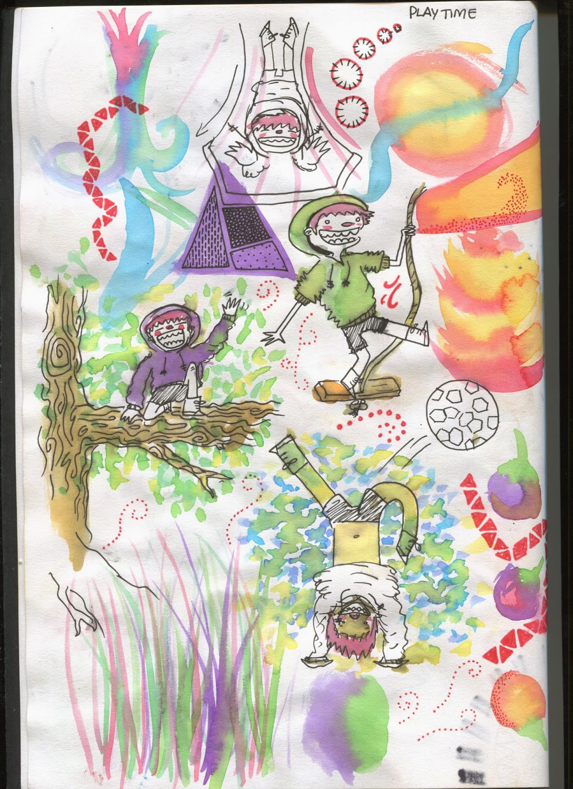
Just a couple of outdoor activities and more shape, colour and pattern experimentation.

Where the green and red met at the top they kind of distorted each others edges and when i drew around the bumpy collision is made a bush texture.
on this next page i decided to play with the bush shapes and made a big colourful one along with some other aspects of nature.


For this page i swapped up my pen and brush for a paper clip i found. I just wanted to try something new and experiment with it. It was pretty hard to control but i liked that it scratched the surface of the paper and left a texture that you could run your fingers over.

Back to the bush texture i decided to draw a multitude of shrubberies.


For this page i had originally intended to draw lots of my character in different activities. I got reference of a child running and it just didnt go well. so i ended up spending the double spread perfecting it. Now i know my character design better as i decided on an exact head shape; which is an egg.


Big scale character. This was just satisfying to draw after trying to draw it over and over and getting it wrong on the other pages.

I tried to make a visual example of wind.

A bit of character work with facial expressions.
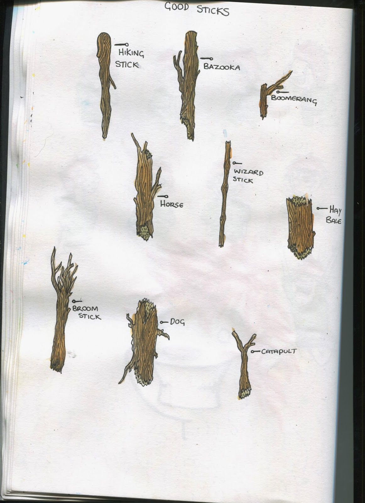
I did a page of good sticks because whenever you were younger and had to go on a long walk it wouldn't be complete without finding a suitable stick to hike with. Talking to others I found that they'd imagined trees as motorbikes and all the pretending games that were played, I like the way they look like ordinary objects but to a child they can be anything.

Putting the character work i learnt with my shrubberies and wind.

After working on this page i was questioning whether or not my character was how i wanted it. So i started trying some different styles out (below) but when i figured the part i disliked about my design most were the eyes, they're hard to convey emotion on and also to make the character look a specific way is hard to convey without pupils.
So a simple change of some new eyes improved it a lot for me. I also made the legs shorter and stumpier because my character didn't quite look child like enough because of the proportions which resembled an adult whereas children have stumpy chubby limbs.

Subscribe to:
Comments (Atom)