Thursday, 14 January 2016
Synthesis
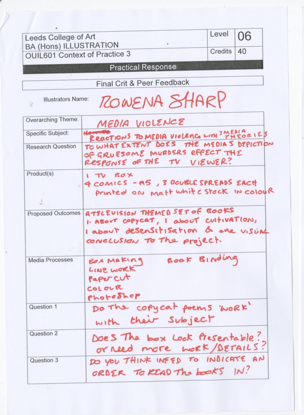
My dissertation tackles how the media’s depiction of gruesome murders effects the response of the tv viewer. Three main media theories have informed the dissertation; Copycat theory, Cultivation theory and Desensitisation theory. The three theories are the basis for my practical work. I have one comic expressing what each theory is using poetry and a certain sense of sarcasm and patronisation. The books take a mocking stance on the theories and to link them all together in a ‘visual conclusion’ I have included a fourth book which states that media can both over exaggerate, underrate the news, or show it as it is. All culminating in the final response, which is a small, bag of salt with the statement ‘take the media representations with a pinch of salt’. This is to show that all three theories explain part of the relationship we have with the media and television. My practical is to point out that we have a responsibility with how we react and cannot let ourselves just be dictated by the media we have experienced. I want the salt to encourage people to fact check and find out the truth their own way rather than being drawn along the wave of sensationalised news stories.
End of Module Evaluation Cop 3
This project started off relatively smoothly but tackling the dissertation half of the module proved to be a bigger challenge than I expected. I wrote and finished one dissertation but had to start again while trying to salvage some useful research from my first one. This blunder threw my time plan into chaos and I focused in on the written to try to achieve the best I could. Unfortunately this means my blog drastically suffered and when I'd solidified my new essay plan I had to try and link in my practical and make it appropriate. Luckily I had three media theories that were a scaffold to each of my essays, and I turned that focus into my practical response. I ended up making quite a lot of work in a short amount of time, to reflect thoroughly I have decided to split this evaluation into separate subheadings relating to different aspects of my work and development.
Research and Blog
So on the whole my blogging didn't go very successfully, I considered myself to be working well when I was blogging every Saturday, but I realise now that once a week was too little and too much time had passed since doing the work I was blogging that I was missing lots of decisions I made throughout the process of making and researching. I Think the way I dealt with my research in blogging could have been better, I tended to just regurgitate the facts I found with the odd sentence commenting. I think I should have used the blog to pinpoint certain facts and expand on them and write about them so that when I got to my dissertation I had writing I could use. In future I should analyse the things I blog, I need to go into more depth so that I have evidence of my understanding and learning. Contrary to my blog, I actually did quite a lot of research, in my first write through I was looking into lots of information about fear and how it effects the brain and responses. I didn't end up using this information, but I can see how researching can inform practical work. As I researched I was having more ideas about work, so I think in the future I would like to try a few more projects where it begins in research, so that it creates an informed product.
Concept
A large weakness to my concept, I feel, is that I didn't think about the context of the piece until much further into production. I think if I had considered that first I would have thought about, and planned for, the prospect of packaging and promotion. Looking back on the project I think I should have prioritised the professional quality over the quantity, I got set on an idea and I felt like I had to complete the whole plan. In reality I think my time would have been much more efficiently used if i had only created one or two of the book, and then built the box and worked on making it of high quality. If I had more time I would have made promotional poster's and mock ups of some promotional material such as mugs and t-shirts.
The concept itself ended up being quite large as I wanted to make a comic for each theory. But I wanted my piece to say something, have a comment to make, instead of just explaining the theories. Last years project went well because there was an opinion which informed the tone and final images/words. Thinking of that success, I decided I needed something to draw my project together so that it 'said' something. This is why included the visual conclusion comic; 'Tell me what you see'. My packaging idea reinforced that I needed four separate comics and so my concept had grown into a sizable project. But I was pleased that I managed to finish it even though not everything was quite up to the standard I would have liked. My project was quite heavily concept and product driven and there was less attention given to process and development. But I think overall I achieved the concept I was aiming for and presented it in a tone of voice that was mockingly patronising with a touch of morbid humour.
Development
My development work jumped about quite a bit as at first I was unsure of what I was trying to say with my piece. Once I got a hold on my concept I had left myself little time to complete a large project but my mind was set on the goal of the finished product and development suffered. I went through periods of time where I would do a blast of practical development, mainly to stray from essay writing, but it meant that I was playing with the materials more and I wasn't working with a final image in mind. This play time got me playing with coloured pencils and lead me to using high contrast colours. I started playing with showing light in colour and these images were most popular in crits and my social media. I ended up not using the exact style I had been playing with because it didn't work as a set with the other comics and I felt it was important for them to work together and show continuity. But it informed my colour decision when it came to digitally colouring my line work, the contrasting colours gave a sense of urgency to the images, which in turn helped convey the cultivation theory.
Once I got into the swing of planning my comics and I knew what I wanted on each page I went into a whirl wind of production. The issue i had in this stage of my work was that I was working specifically to get my planned idea out and done. This made my work much less playful and I just went straight into making final images, sometimes if the first draw of something went well enough I'd just accept it as done and colour it with the rest; the Marilyn Monroe was only drawn once. Although I was going to leave my original Brenda Ann Spencer pin up as it was but the Marilyn was on such a higher scale of quality that I felt I needed to redraw and improve Brenda Ann so she would match. So my need for continuity helped me do some development, even if it was just competing with other pages of the same comic.
I think it would have helped me also to involve some contextual research during my developmental and planning stages. I didn't really specifically look out an work that was similar to the one I was planning. I saw things I liked through my usual processes of pinterest and instagram but I don't feel I was fully engaging with it and thinking about it. I need to start constantly re-evaluating if I'm successfully thinking of my work in a real world context to get the best out of it. The one thing I did look at contextual research for was my box, because it was based off of a sewing box design I'd seen in a charity shop with collapsing sides. That was one part of my development I was proud of; my tv box. I started with my mini prototype and it was received well in crits which made me want to pursue it. The size of my comics meant that I had to scale up the design significantly. I kept adding to the box as I was making it, like the clear plastic seal I put all over it. I saw the man in the library coating books with it and I thought it would make my box prototype look better crafted and more permanent. Due to measurement flaws when making it, I ended up having to make an aerial on top' to act as a handle because the box was incredibly hard to open once coated in plastic wrap because it made it quite tacky. Then in the final crit I was demonstrating how difficult my box was to open and I broke it. So I took this opportunity to once again improve it and it pulled it apart to trim down so it would slot inside the lid. I think this continuing development on the box made me push the design to look much better than the original model.
Overall I think the development of my project had a mix of highs and lows, mainly due to bad time planning and unbalanced priorities. But in the parts where I did actually sit down and develop my work, it went well and improved the overall product. In future I will make development a more important process as it's what helps me improve my work, without I just keep producing similar things.
Presentation
The box and the products work well together and the whole aesthetic of the packaging makes it seem quaint and twee, which contrasts from the comics contents but I like that sense of secrecy; the real contents hiding behind a façade of cute. But I think it would have improved the overall look of my work if I had worked on packaging the box itself and making labels so that it looks as though it is ready to be sold into a shop. I had always intended it as a product that could be sold, but minus packaging and any promotional material it looks more like a gallery piece. If I had more time I would have made mock ups of posters advertising the product and some promotional items such as mugs and tshirts . I think it is clear that context came second to product in this project.
The box as a whole I think conveys the idea of the box I am proposing if it were to be commercially made. Since making the final adjustments to it, the lid was easier to use and it slides down satisfyingly into its close fit. I think the elasticated lace inside added to the charming aesthetic of the packaging but I had also planned to have the four panels slightly padded so the comics would rest on a small elevated cushion attached to each panel. But time constraints meant I had to forgo this part of my design. Another strength in the presentation of my finished product was the continuity of the comics inside. Each of them had a matching cover which linked them obviously and I included my logo and information one the back as I would if I was making it to sell. I included a pattern inlay on all the book because I think it adds a certain amount of professionality and also it was something else to link them further. Originally I had planned to fill the screens with images specific to each book but I sacrificed this to save time. I think they work better without images inside anyway because this way they are all exactly the same and the continuity is obvious. Overall I think the presentation of my project went well, the box packages the comics nicely and is also linked to the themes running through both practical an written. But since I spent so much time crafting the box I can't help but think I should have packaged that too. My presentation could have been improved by including things that would be present if the product was in context; such as price, bar code, information, blurb etc.
Synthesis
The synthesis link was quite straight forward because I based my project off of the three media theories which informed my dissertation. This gave me a stable starting point to expand on and construct my practical around. I think that the understanding of the three theories through my research and written work helped inform my drawing and the contents of the comics. I think I needed something very solid to base my work on as I don't deal well with broader more vague themes/subjects as I get easily off track, which was clear in my dissertation development.
Although the theories worked well in structuring my practical I think it may have improved my work, if not just my developmental work, if I had played around with different idea's and parts of my dissertation to inform the practical. The theories went well but I can't help but feel I might have missed out on something better through lack of experimentation and brainstorming.
Product : some strengths and weaknesses of the individual parts of the final product
Box
- Broke easily
- Can see tape
- Could have used a more permanent material
- Didn't coat handle and screen like rest of box
- Buttons drawn from two different angles
+ Worked once fixed
+Satisfying fit
+ Lace added to charm
+ Clearly represents subject matter
+ Outer layer is almost bubble less from plastic wrap
Copycat
- Less detailed than other books
- So i could have done more pages
- Handwriting was rushed and didn't compliment the words
- Not all character and shaded with darker colour to make shadow (inconsistent)
- Forgot about making floral borders for around poetry to exaggerate the 'lovey'-ness
+ Brenda Ann Spence went well, good colours
+ Overall colour pallet was better
+ More play with specific hues of a colour gave better results
+ The poetry worked well and added a sense of humour
Cultivation
- Cut out before I folded made it awkward to fold after, almost ripped
- Design was rushed as it was my last comic
- Should have put words on the blank pages to match other comics
- Blank pages looked empty and wrong
- Had to cut out one inlay at the back because I hadn't properly counted my pages (not multiple of 4)
+ Contrast colours went well
+ Colour and light play in development informed final pieces
+ Concept of this book was popular in crits
+ Cut out relatively neatly
Desensitisation
- Forgot to include levels going up.
- Level 100 doesn't make much sense now
+ Although people still seemed to get it in crits
- Dead child page only has one image whereas all others have two (incontinuity)
+ Lots of detail achieved
+ Gruesome aesthetic - got point across
+ Made people laugh in crits
Tell me what you see
- The red and blue screens don't work as well as I wanted
- The middle spread blue section is of lesser quality than the other drawings (incontinuity)
- The final image seems quite bare, I think I should have added some line as texture
+ The bag of salt. I just really like it. Sounds pithy.
+ The look of the blue overlapping the red looks really nice.
+ From afar looks interesting
- Could have done with more detail to take full advantage of overlapping lines.
Final Crit
I made some hand drawn elements to use on my project boards because then they would link directly and visually with my practical piece. I made a character to be a logo and created a uniform border. The waves crashing do use up a lot of room but I like the overall look so I think it was worth the sacrifice of space.


The main thing i was told to improve in final crit was my blog which was almost non existent and to get on and finish my practical, I was still rushing to do my dissertation writing so I was juggling a lot of tasks at the time.
People seemed to find my project boards easy to follow and understand the project and they liked the look at the work that would be included in my books but it just wasn't in a finalised point and that made it hard to evaluate at that point.
Box the Builder
I started the design in mount board like my last prototype but on a larger scale. Since my books are A5 I had to significantly scale up from the 10cm one before. This is the pieces sat open to see the full width of the opened box.

In comparison to my large mason jar to show how big it ended up being.

I coated the box in clear plastic wrap, I had seen the man in the library using it to protect the books and I thought it would make my box look more finalised and more permanent as it would be moderately wear and tear proof now. It used to be sold in big wrapping paper rolls in morrisons but they seemed to have discontinued it. The only kind I could find was in Wilkinson's and it was just 30cm tall, luckily my box is 27cm. It was a close call but it just fit. The length also just filled from the top of one side around the bottom the the other panel edge which was useful. But the close fitting meant there wasn't much room for error. I did the inside first while i was seeing how to put it on best because if this one bubbles (and it did) it would be hidden from obvious view. I got the hang of it by the time i reached the outside and it has minimal bubbling.
Unfortunately the addition of the plastic wrap made the box quite tacky and the close fitting lid kept sticking against the inside making it difficult to open. I made a handle on top and decided to disguise it as an aerial, this helped a bit but it was still really awkward and i was worried that it might not be openable once id submitted.

In the final crit though I was demonstrating how hard it was to take apart and it broke. So since the plastic wrap already got ripped, i sliced the sides off and trimmed down the parts before taping them back together. It looks ledsss professional to have the tape showing but the way the box opens and closes is such an improvement I think it was worth taking the hit on aesthetic in favour of functionality.

The finished product. I added buttons and a screen as well as the aerial to make it clear what it was. Also I liked the charm it gave it. The overall effect of the box is cute which I like because it contrasts from the more graphic innards.

I made a ribbon securing band to hold the panels of the box up because that way it was easier to close instead of trying to balance all four while squashing the lid over. I wanted the box to be as functional as possible. Obviously if it was made commercially the box would be constructed from some form of plastic rather than a paper based material. But for a prototype it sufficed, as i mainly wanted to convey the design and functionality.

Inside the books sit all snug. I numbered them so that there is an obvious order to read them in. Because the conclusion book has to be read last as it would make any relevance otherwise.

I put small stilts on the corners of the bottom panel because when the sides were up they were falling into each other instead of standing straight. This helped support them.

Each book got secured with the lace ribbon that I stitched into the edges. I did this because it added to the charming aesthetic of the box. I accidentally spilled baby oil all over my lace a couple of days before but it actually made it smell really good which just adds to the overall effect of the box.

Relatively straight stitching. I stabbed my finger 3 times doing this. If it was made commercially this would be machine done or simply glued to get the most clean cut effect.
Tell me what you see: Journey of making

This is where the idea to overlay the blue and red line first started, relatively simple sketch at the time. I was thinking of using it for desensitisation but it seemed like a clever way to show the two sides of a new story in my concluding comic. I renamed this comic 'tell me what you see' because the other one was a question and the question mark didn't fit in well with the title page style.

This was the last book I worked on and there was a real sense of urgency to get the pages drawn out and finished in time for my pre booked print slot. I missed that slot because i ran out of time but managed to get these done for the next day. This first one shows how news can be reported as worse than it is and i chose an daily understood and recognised example; protesting. This shows a protest shown as being aggressive when in reality it is a sit down peaceful protest. But peaceful doesn't sell in the news. I liked how the characters came through in this piece, i used reference for full body shapes as i tend to struggle with realistic poses that don't look static. Although the leaning riot guard was without reference and was done quite quickly without drawing our the mechanics of joints and lengths like i normally try to do. This taught me that sometimes the best way to make a pose look natural is to take liberties with the body shape and exaggerate some parts. And generally not worrying about it made it come out much easier. If i had more time I would have liked to make a bigger crowd scene and really explored the reality of drawing mass amounts of bodies.


This one talks about news stories that are made out to be less and so I chose the idea of government officials taking liberties with tax money. The lesser image shows a politician steal a tenner from a working man. But the reality image shows the politician with his two houses and filling his pool with tax money. It is an over exaggerated image but it helped to show the concept of the piece a bit more clearly. I don't like the quality of the below drawing though, if i had more time i would have redrawn this as it didn't seem to fit quality wise with the other images. The line work seems rushed but time constraints meant i jut had to deal and try and fix some parts in photoshop.


For my last image I wanted to include a small bag of salt. So that i could say here is the pinch of salt to take your media with. This seemed to be the entire point of the whole practical pice and this statement seemed to conclude it. Which is what i wanted this comic to do. I was going to originally have two news scenes exactly the same overlay sand slightly off set to show that sometimes the news also reports accurately. But with the idea of the salt I felt it was better to just put a character talking directly to the reader, to really simple spell out the message to them. I drew myself because it is my opinion and also i'm quite quick at drawing myself and this helped shave a bit of time off. It'll still use both colours and be slightly off set but I think that could create a cool 3d effect. Also the red and blue slightly offset kind of looks like when an old tv wasn't quite in focus and around the edges you could see the offset of the RGB.
Desensitisation: Journey of making
The desensitisation comic was probably the one i was least worried about because it was taking advantage of the fact that I already draw a lot in that over exaggerated gross way. So I didn't do too much development in the style, my main exploration in this was thinking of the most provocative pictures and also to improve compositions.

This, I made, just to demonstrate the kind of image I wanted to fill the comic with. This did particularly well on social medias which was a bit of a shock because I never fully finished putting the texture in. But I think it was the concept of the image that made it work. The use of red stands out, this helped make my decision to use red in this comic. It is the most obvious colour to use which may be a bit cliche but it gets the point i intend across.

This was some experimentation with lesser gore, I figured that animals are generally given less of an emotional response. (except in pets) But i was thinking more like road kill at the side of the road, its a regular occurrence and you can see it often so I think this is a good starting point as it is something that most people are already some what desensitised to.

This was a play around with a big image and made me realise that the level of detail i was going into did not lend itself well to large scale. It took far too long and I never finished it, but it gave me ideas of things to try. Although I actually only used the heads, I was concentrating more on death and gore to shock. But if i was to improve this comic it would be to use the other examples i came up with too such as cannabilism, rape and the little Ed Gein-esque character in the back ground. This piece stood out at crits and people liked it but they agreed it was too time consuming. But this reinforced the idea of the style i was aiming for in the book.
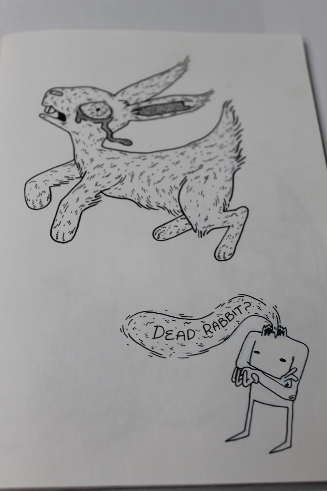
I started with the road kill and I ended up making a little narrator because I felt it was the best way to patronise the audience and show the mocking nature of this project. At first I ended up drawing him very similar to the narrator in last years project. Then my epiphany was to decapitate my narrator because it fitted in with the gore and then I could make the narration flow out of his neck. At first I was just using the lines I had done in the other book (flowing non connecting) just so it would match and it looked better than a speech bubble. It wasn't til it came to colouring that i realised if i coloured it in red it would look like blood pumping out of his neck stump. I really liked this effect because the 'blood' stood out boldly on the page and it fitted in with the overall aesthetic.

To up the anti I made this one clearly road kill. I particularly liked drawing the tire tread marks through the leaking innards.

Next i went with my decapitated heads. People respond more emotionally to other humans so I thought this was an appropriate next step. And the decapitated heads in my prep work had worked well. I like the rotting one best because there were more textures to create like the remains of muscle and tattered skin. I made the blood speech flow around the image so that the two were more integrated, because it seemed more obvious in the last two that the narrator had been added after the initial drawing.

The next step was to take it to a child. I really struggled getting the pose right and proportions because children have weird little limbs but big heads. I ended up trying multiple references of children lying down and eventually ended up using a stock photo of a drunk adult and just scales the arms and legs back. There were going to be two parts to this page originally, one with the dead child and then the final one being her moments before her murder. I thought the expression on the face of fear would be the best ending but time constraints meant i cut that one out. and concentrated instead on making the child really gory. The narrators speech in this one frames the image but I think I should have played more with the space and considered that it would fit an A5 on its own. All the other pages have 2 images on so this one looked a little unbalanced. In colouring I added some drops of blood coming down to try and make the space less empty.


This is my final congratulatory page. This is the page that made people laugh in crits and therefore I consider it to be a successful end to this comic as it properly displays the mocking intent of the comic. I ended up using less detail than I originally planned, as at first I was going to fill the entire page with intense detail. But i was reminded of that earlier exploration when i learnt that large scale was too time consuming and decided to downgrade my plans. I think this works better though because the space in between the heavy detail and the bright character made the eyes draw toward the text. The text is the biggest part because that is the final statement of the book and what i think explains the point of it. Which is needed a bit since I forgot to include the levels on the pages as they went up, so theres no mention and then suddenly level 100. But the phrase level 100 gets across the right idea about the level of desensitisation even with out the leading up ones.
Cultivation: Journey of making


Fred pointed out to me that although I wanted to do a different style for each book they should still look relatively similar. Since the Desensitisation and the Copy cat book both used similar line quality and process of drawing this one looked out of place. I decided that I would take the colour parts that I learned but that I would draw it with line work so that it linked with the other books. I would have liked to use the coloured pencils and just overlaid the line so I could keep the texture, but again it looked odd for just one book to be coloured analogue. So I had to sacrifice a lot of the development in this comic so that it would work with the others and my continuity would be strong.

I went straight into making final images as this was one of the books that I was running out of time for. I added in more line as texture to fill out the lack of texture digital colour was going to give. I think this made it sort nicely between the desens and copycat books style wise.

I made this one the most covering, and just had a door covering up the violent part. I liked the connotations of peeking through a door with the chain still on. It hints it's in a rough area, the person opening the door is already untrusting and doesn't fully expose themselves. But when you lift the flap you see that the chain stopped them seeing the shooter in the bushes, or at least thats what the person behind the door assumes is what they can't see.

In this one I just filled in the violence with the rest of the other scene so they were simply not there in reality. The only hint of them being the endue of the womans hand, just illuminated by the lamppost. I added in the swirling non connecting lines I used in the last comic to further link the styles and also because the wavering, loose outline seemed to suit something non-solid such as light.


For this one I covered them up with the moon and some clouds, this one plays with the fears regarding youth culture and the assumption that majoritive teens are aggressive and violent. I consciously left the sky blank behind them and decided to just make it really dark and night time. This was because I was becoming painfully aware of time slipping away and I was trying to do lots of things to shave time off of my production. Again it is obvious that my project was completely product and concept based as I was determined to finish what I set out to do.


I decided to not go with the idea of doing a half and half logo because the book was about hidden things so it didn't fit anymore. I actually made a covering flap for this so that the man wouldn't be seen until you lifted up the burger, with the only hint being the faces worried expression. But i didn't fully consider production as the flap would have to be glued/taped to the other side and that would make the inlay look un professional. So I ended up not including it as I think the image makes the 'hiding' concept obvious, because he is literally hiding. He's just hidden really obviously.
CopyCat: Journey of making.

So i started by just drawing two of the people I had been researching and discussing in my first dissertation write through; Brenda Ann Spencer and Marilyn Monroe. Both of which were suspected to cause copy cats. I was playing around with writing silly adoring poems to them, I thought this best demonstrated the thoughts of someone effected by Copycat theory.
Brenda:
Brenda Ann Spencer,
you shot at a crowd
school children screamed
but your voice was heard loud
'i don't like mondays'
thats what you said
so lets liven it up
and shoot people dead
Marilyn:
Marilyn Monroe died quite young
most of her song, yet to be sung
young forever, never grow old
memory growing with movies sold
i shall die young and join you in glory
my death on tv alongside your story

The first drawings were quite terrible as I'm not as used with drawing characters to look attractive, i have got too used to making them ugly and gross. But this little face went quite well and informed me of how to tackle the attractive images. I put less texture into them and only really added it on hair and clothing rather than my usual blotchy lumpy skin. I liked the idea of displaying Monroe in her moment of death, just because it further ridiculed the aspect of idolising her death.

I redrew Brenda as the first one was un-proportional and didn't look as clearly pin up as I wanted. So i tried again this time finding reference first of different pin up poses. The waist is made quite ridiculously small in this one, but it was in my reference, the pin up style exaggerates all the sexual parts of the woman, big knockers, small waist, long legs, dainty feet. The overall look of pin ups seemed to be in need of help or cheeky, which is rather demeaning but it gets my point across.

This is my Marilyn. I really love how she turned out, I think starting with an image that was done by a photographer helped because the best composition was already found. Then I just added puke all around her, this is a big one and I want it to be centre spread. This piece did popularly on my social media's too, because it is instantly recognisable and has a bit of dark humour. I like the lines i did around the puuke, I avoided joining them up and just made them roughly out line the liquid with swirling lines. I think this made it look more fluid and added a sense of movement to the piece. If I had time this would make a great gif, with Monroe puking , it swirls around her and he dress blows in the wind. Although I think the dress blowing is something outside of my understanding and skill of movement. So i'd definitely need video reference for that.

I was just playing with writing nicely here. Adding the lines around that I had just done for Marilyn's puke.

This one just looked particularly nice, which is contrasting because it says liver, which is not nice. I liked the contrast between aesthetic and definition. So this is how I will do my titles as it is visually apealing and fits with my line work inside.

Drawing out some of the titles. I tried the lines flowing around the shape of the word but that made each title too different and I wanted to achieve continuity across the board on covers. So they work as a set. The circular titles were much more uniform and the curves lent themselves well the the flowing lines.

My first attempt at a pin up man. Men are harder to make into pin up because the things to exaggerate with women seems obvious, maybe this is because there are more examples of women being shown in this sexual manner. I chose to do a bomber because it is a current issue and that made it a little bit risky but I think it gets the point across clearer of the delusional nature of copycat theory. But I wanted to change the pose because this one was too static and awkward and I don't know how I would space the poetry around him.

Starte final drawings. I re-did Brenda Ann once again because after completed Marilyn I realised she was of a much higher quality, compositionally and proportionally. I wanted to fix the stomach as well into something slightly more realistic. I used the same pose because I felt it worked but I had her hold her rifle instead. I looked up the gun she used for reference so that it was an accurate depiction, as someone suffering copycat delusions would want.
The columbine kids were a bit of a challenge, they were men so it was already awkward to make ridiculously sexy, but secondly they were teenaged so I couldn't go down the obvious route of making them gruff and manly. I used reference of a men modelling suits, I feel a well tailored suit is almost a parallel to women scantily clad. I think the most important part of this drawing was just getting the trench coats in, although that kind of made the colour scheme not as bright and complimentary because they are mostly in black. I chose lots of shades of grey to attempt to link them to the other complimentary colures images.

I used reference for both of these images. For the bomber I decided, to make it clear that this was a mockery, make him ridiculously sexy. I used another male model for reference as there doesn't seem to be many art references of pin up men. But contemporary magazines were helpful to show me how to make a man look overly sexy. For the 27 club I specifically picked out Amy Winehouse and Jimmi Hendrix because they are easily recognisable and have aspects that I can draw to make it clear, so even if the faces don't look enough like them the other parts will; winehouse beehive and eye flicks, Hendrix's big hair and jazzy jackets. I drew them quite small together because I wanted to leave enough room for the poem, which I hadn't wrote yet so I was unsure of size.

Finally poems are written! the Columbine one was one I struggled with the most because there is not many options for rhymes with Eric Harris, Dylan Klebold or Columbine. But i got around it eventually.
POEMS:
Brenda Ann Spencer
Window open, curtain drawn
Children stood on school yard
lawn
You shot them down, they
screamed and ran
Oh Brenda im your biggest fan
I’ve practiced my aim,
prepared my speech
I wonder how many my story will reach
‘I don’t like Mondays’ that’s
what you said
So lets liven it up, and
shoot people dead
Marilyn
Marilyn, the icon of beauty
Took her pills, now off duty
Immortalised in her prime
Oh how I wish that fate be
mine
I shall die young and join
you in glory
My death on tv, alongside
your story
Columbine
Columbine highschool 1999
Eric and Dylan crossed a line
Trenchcoats donned they
opened fire
Was it me you were trying to
inspire?
The Bomber
Bravely you take your life
So others will be ‘saved’
Then you can take your path
to bliss
That with virgins, will be
paved
I will follow you in suit
My body will be blown
So all across the world wide
web
My name will be known
27 Club
27, Golden age
Take me to the centre stage
Forever young and oh so
tragic
Death in glory looks like
magic
Subscribe to:
Comments (Atom)