The desensitisation comic was probably the one i was least worried about because it was taking advantage of the fact that I already draw a lot in that over exaggerated gross way. So I didn't do too much development in the style, my main exploration in this was thinking of the most provocative pictures and also to improve compositions.

This, I made, just to demonstrate the kind of image I wanted to fill the comic with. This did particularly well on social medias which was a bit of a shock because I never fully finished putting the texture in. But I think it was the concept of the image that made it work. The use of red stands out, this helped make my decision to use red in this comic. It is the most obvious colour to use which may be a bit cliche but it gets the point i intend across.

This was some experimentation with lesser gore, I figured that animals are generally given less of an emotional response. (except in pets) But i was thinking more like road kill at the side of the road, its a regular occurrence and you can see it often so I think this is a good starting point as it is something that most people are already some what desensitised to.

This was a play around with a big image and made me realise that the level of detail i was going into did not lend itself well to large scale. It took far too long and I never finished it, but it gave me ideas of things to try. Although I actually only used the heads, I was concentrating more on death and gore to shock. But if i was to improve this comic it would be to use the other examples i came up with too such as cannabilism, rape and the little Ed Gein-esque character in the back ground. This piece stood out at crits and people liked it but they agreed it was too time consuming. But this reinforced the idea of the style i was aiming for in the book.
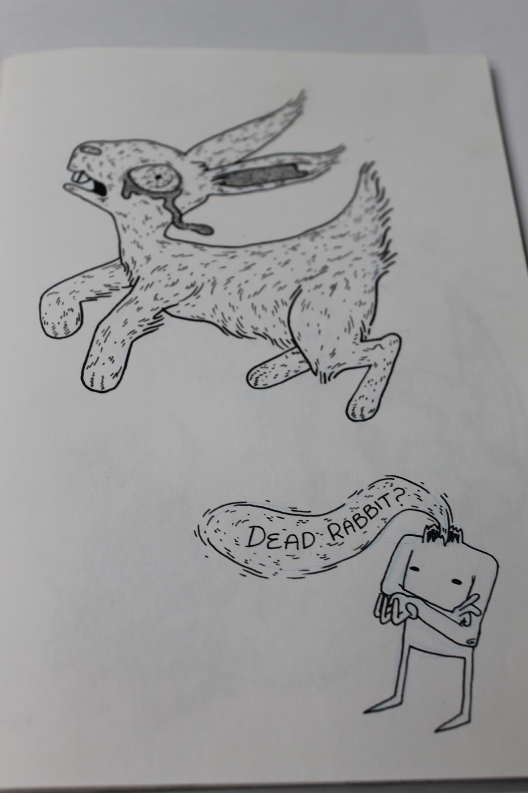
I started with the road kill and I ended up making a little narrator because I felt it was the best way to patronise the audience and show the mocking nature of this project. At first I ended up drawing him very similar to the narrator in last years project. Then my epiphany was to decapitate my narrator because it fitted in with the gore and then I could make the narration flow out of his neck. At first I was just using the lines I had done in the other book (flowing non connecting) just so it would match and it looked better than a speech bubble. It wasn't til it came to colouring that i realised if i coloured it in red it would look like blood pumping out of his neck stump. I really liked this effect because the 'blood' stood out boldly on the page and it fitted in with the overall aesthetic.

To up the anti I made this one clearly road kill. I particularly liked drawing the tire tread marks through the leaking innards.

Next i went with my decapitated heads. People respond more emotionally to other humans so I thought this was an appropriate next step. And the decapitated heads in my prep work had worked well. I like the rotting one best because there were more textures to create like the remains of muscle and tattered skin. I made the blood speech flow around the image so that the two were more integrated, because it seemed more obvious in the last two that the narrator had been added after the initial drawing.

The next step was to take it to a child. I really struggled getting the pose right and proportions because children have weird little limbs but big heads. I ended up trying multiple references of children lying down and eventually ended up using a stock photo of a drunk adult and just scales the arms and legs back. There were going to be two parts to this page originally, one with the dead child and then the final one being her moments before her murder. I thought the expression on the face of fear would be the best ending but time constraints meant i cut that one out. and concentrated instead on making the child really gory. The narrators speech in this one frames the image but I think I should have played more with the space and considered that it would fit an A5 on its own. All the other pages have 2 images on so this one looked a little unbalanced. In colouring I added some drops of blood coming down to try and make the space less empty.


This is my final congratulatory page. This is the page that made people laugh in crits and therefore I consider it to be a successful end to this comic as it properly displays the mocking intent of the comic. I ended up using less detail than I originally planned, as at first I was going to fill the entire page with intense detail. But i was reminded of that earlier exploration when i learnt that large scale was too time consuming and decided to downgrade my plans. I think this works better though because the space in between the heavy detail and the bright character made the eyes draw toward the text. The text is the biggest part because that is the final statement of the book and what i think explains the point of it. Which is needed a bit since I forgot to include the levels on the pages as they went up, so theres no mention and then suddenly level 100. But the phrase level 100 gets across the right idea about the level of desensitisation even with out the leading up ones.
No comments:
Post a Comment